After numerous failed attempts at making maps for my books, I decided that I’d go a more classical way. I am no artist, but I can trace well enough. Using a light table, 14 pages of 100%-resolution US Geological Survey maps from 1955, and a few pencils and pens, I reconstructed the route over the Santa Cruz mountains and up past Boulder Creek. But there were numerous factors to consider including:
- Conflicts between historic sources regarding the right-of-way,
- Which waterways to include and which to leave out,
- Which roads to include and which to leave out,
- How to denote tunnels, trestles, and other features, and
- How to differentiate the three primary features on a black-and-white map.
Each of these problems I took in turn. For the right-of-way, I generally used a combination of USGS maps dated prior to 1940 (or, in one case, from 1940), railroad survey maps from around 1907, and contemporary information based on scouting of the specific regions, especially for the areas north of Boulder Creek (thanks to Duncan Nanney for much of this information).
The decision regarding waterways was more simple. Obviously the entirety of the San Lorenzo River was included from its headwaters to its outlet to the Pacific Ocean. Other than that, waterways were chosen based on how they impacted the railroad. If a trestle was involved, the waterway was included. If the railroad was forced down a specific path because of a waterway, it was included. In a few cases, it is included because of its relative importance (such as Bean Creek).
Roads are the more difficult challenge. Highway 9 especially changed course multiple times through the years. Its 1955 alignment was chosen for my maps and in most cases, it follows the current alignment. Other roads were chosen based on historic importance, with modern-day Highway 17 appearing alongside the historical Glenwood Road (the former Glenwood Highway). In Felton, Conference Drive (historically Mount Hermon Road) trumps today’s Mount Hermon Road, since the latter conflicts with the geography of the region during railroad times. East Zayante Road is shown until it turns away from the tracks, while in Santa Cruz, CA State Route 1 is shown mostly as it is today since the freeway was built soon after the line over the mountain was closed. Roads are a constant difficulty in these maps, but they provide a context to both then and now that many will appreciate. While they probably will not be named in the end due to frequent name changes for many of them, they will remain as an important part of the evolution of the railroad.
Differentiating between the features is a whole different problem. I decided that stops would have simple dots to note their locations, generally on the side of the track where the structure, sign, or platform sat. Tunnels would be large rectangles that are wider than the tracks. Bridges would be the same width as the track but be hollow inside. Other railroad features, such as sidings and spurs, would be notated by adding track to the side of the main line.
The three primary features themselves were dealt with initially by being three separate layers. Rivers and creeks (and the ocean) constituted one sheet of paper, roads a second, and the track itself a third. Once input into Adobe Illustrator, the three were created as separate editable layers that were then “Line Traced” to render them as vector-based images (and quite a bit smaller in file size). From there, the river and creeks were hollowed out and made bubbly to make them look like water. The standard-gauge track was doubled in thickness and all segments of track that were never standard-gauged (i.e., they remained or were only ever narrow gauge) were isolated from the main line with cross-ties added to differentiate them from roads. The roads remained 1-pt wide as they were originally rendered by the Line Trace.
Once all of this is done on each of the 14 segments of the map, they are added to a master page that combines all of the maps together into one geographically-accurate grid, from which segments can be pulled for the five individual pages in the book that will be dedicated to maps (they will be facing the title page of each of the five primary sections of the book). Actual text is added at this point in the standard font and size of the actual book.
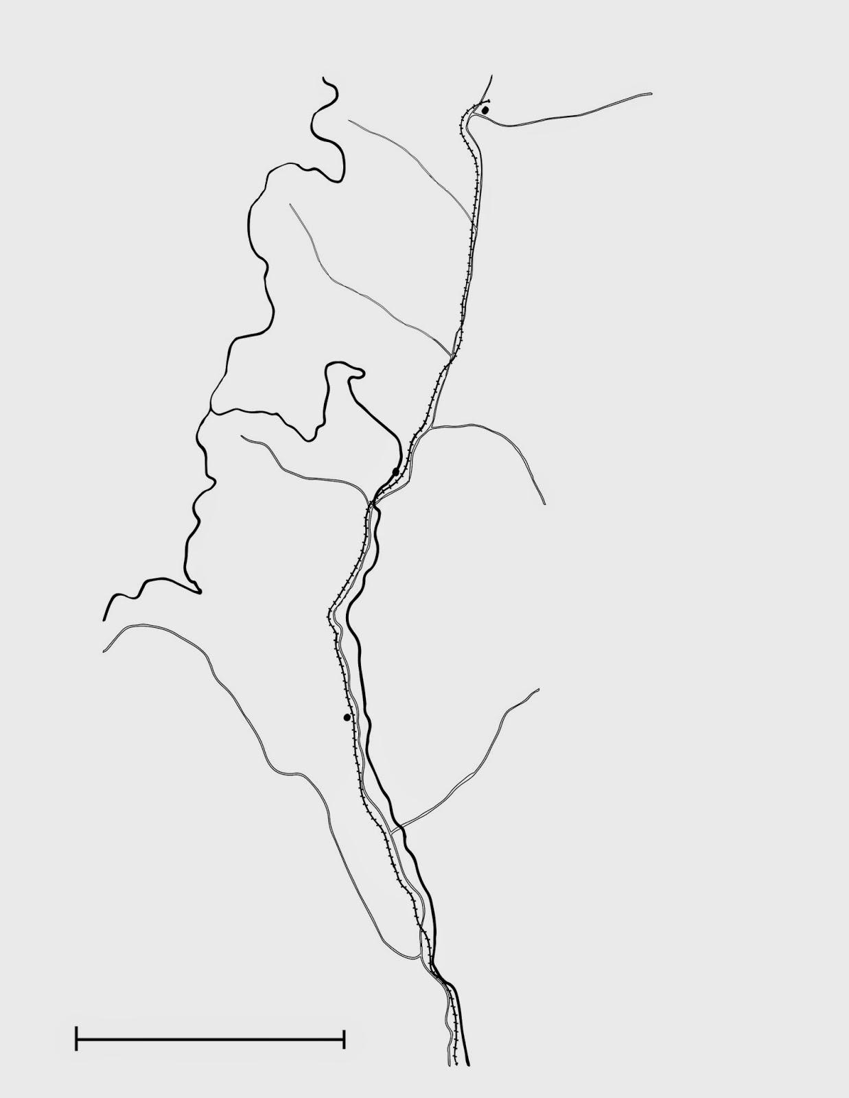
So now that I’ve gone over all of this, most of you are probably eager to see what I actually mean by it all. Here’s a visual process of what I did. The following is a map of the northernmost part of the Dougherty Extension Railroad, just north of Riverside Grove. It is not entirely cleaned up yet (I’m having problems connecting overlapping end-points), but I can still use it to illustrate my point.
I started with a USGS map:
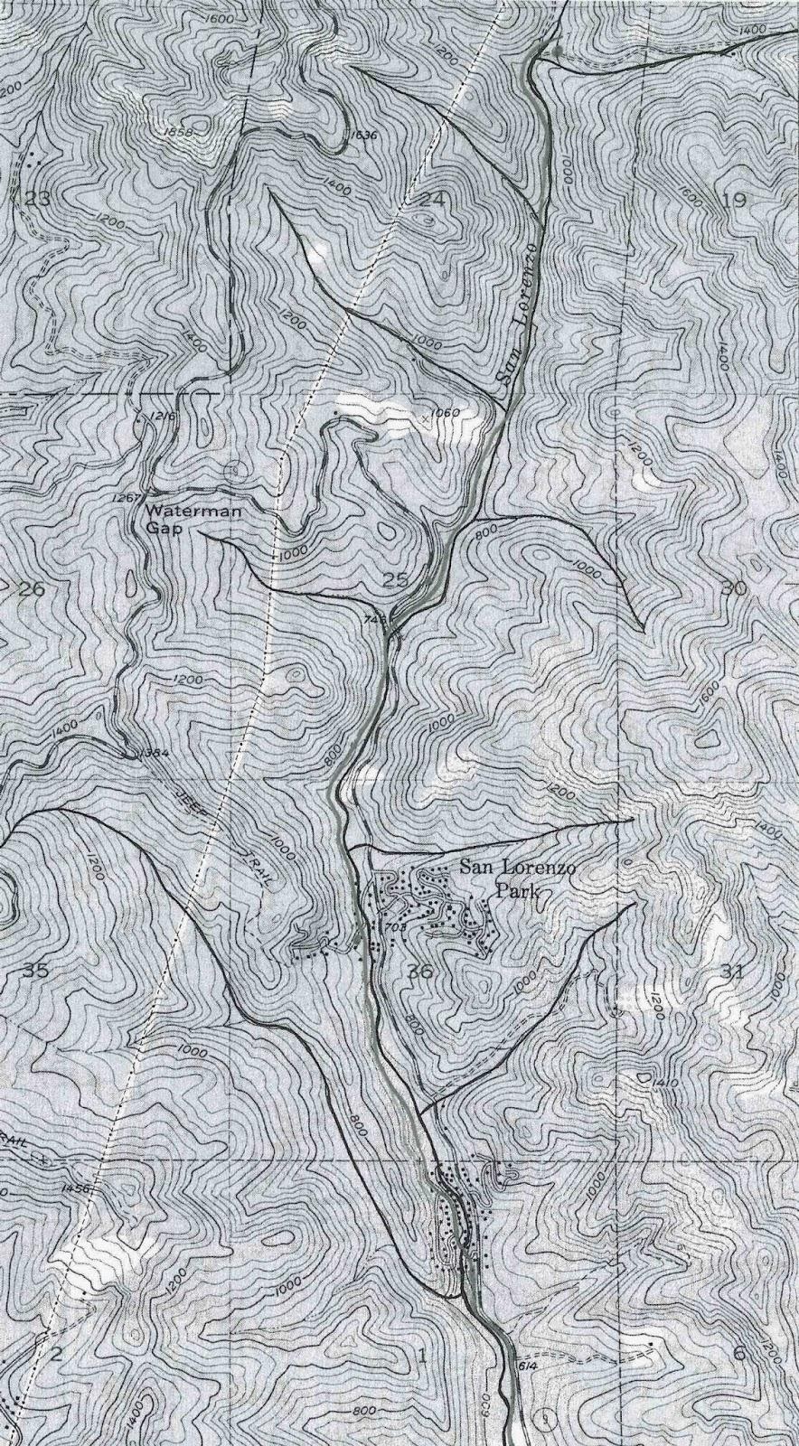
Using this map, I outlined the major waterways in pen, and the path of the railroad in pencil. Then, using a light table, I transferred each of these and Highway 9 and Highway 236 onto three separate sheets of paper, copying also the scale ruler from the first map I copied from (remember, all these maps are at 100% resolution):
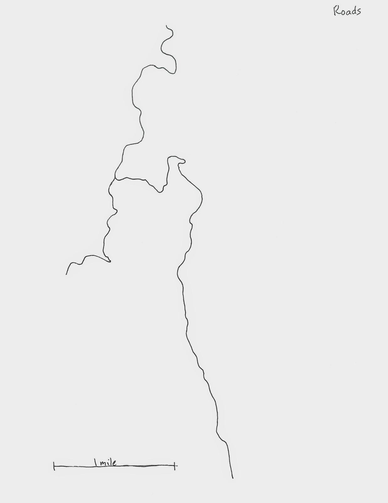
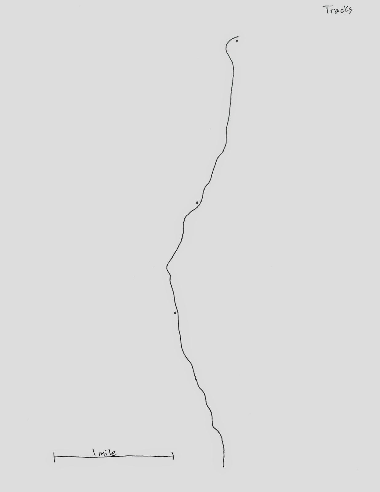
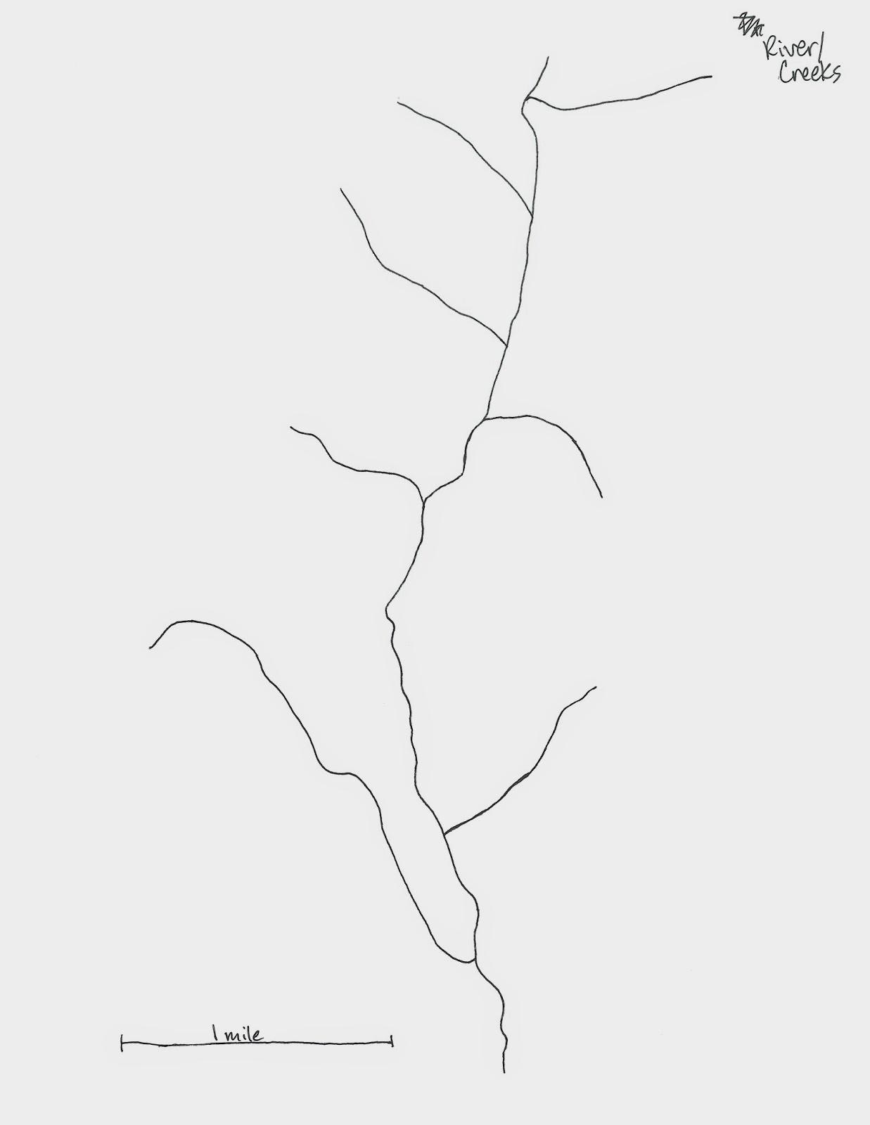
With these three maps completed by hand, they were then scanned and inputed into Adobe Illustrator where they could be prepared for the actual map page. The lines are traced and copied into a joined overlapping file with each page being input as its own layer. The layers are assigned different colors and then moved into their appropriate places. Labels at the top of the page are removed and the ruler is replaced with a digital copy. Trestles and tunnels are added, while station dots are replaced with black squares. In the example below, trestles have not yet been added due to an annoying error in Illustrator. Waterways have also not been named, though they will—I have yet to figure out how to get them to render well.
Finally, in iWork Pages, the formatting program for my book, I add captions for the locations (and, in this case, for one of the creeks). That ends with the final image:
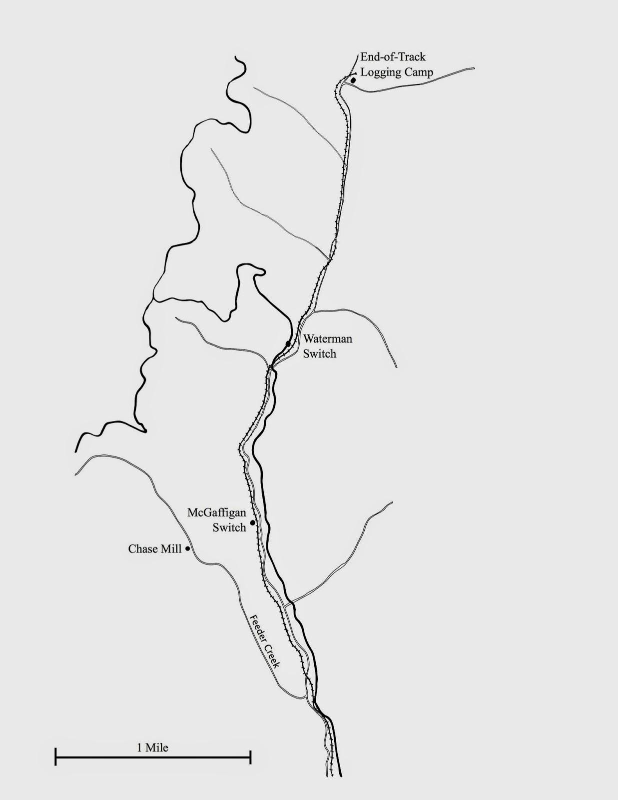
That’s pretty much it. It takes a good amount of time per sheet but each map becomes easier to do than the last. Eventually everything will be combined into a über-large map that will then be divided as needed for the five book maps.
Let me know what you think, and feel free to give me your thoughts and opinions on the process, the end result, and possible changes I should consider making. Cheers!