Most people know what a typewriter is and a good majority of readers will have used one before. I mean, the personal computer in its modern iteration really only became affordable in the mid-1980s. But what everyone seems to forget is how awful the default font was. You see, newspapers generally use some variant of Times—a font literally designed for newspapers (the New York Times, anyone?). But the typewriter, after much give-and-take over a century, finally settled upon Courier—a blocky serif font that leaves no room for ligatures but plenty of room between characters.
Today, there are a lot of organizations and businesses that do OCR work. OCR stands for Optical Character Recognition and, in general, it means reading text on documents that were not originally created digitally (or the digital copy has become lost). But Courier continues to elude text-recognition systems because of how clunky it is as a font.Text recognition systems are not always able to recognize proper spacing between Courier characters, so they will just add spaces or delete spaces wherever it feels it is appropriate.
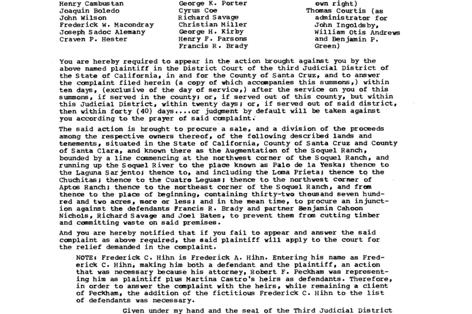
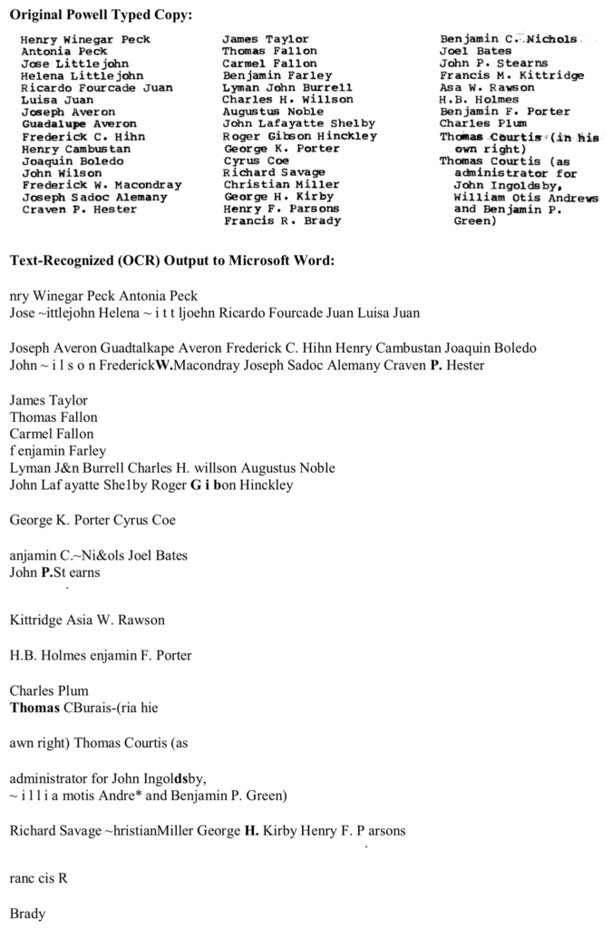
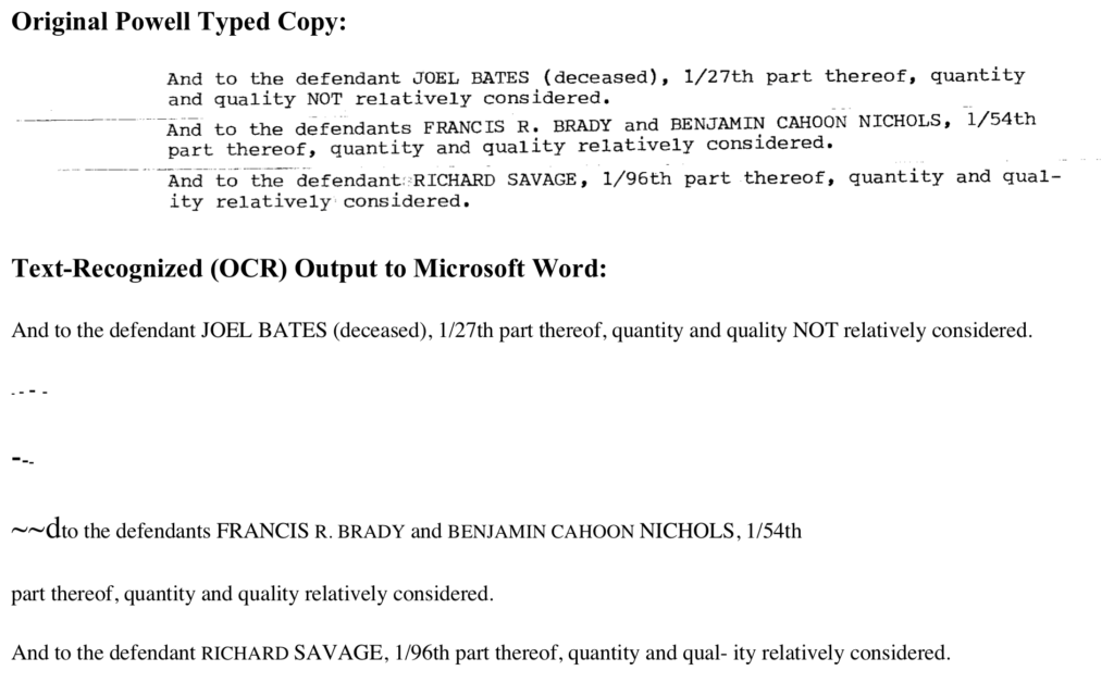
Text-recognition software struggles especially with formatting. The three columns presented here simply cannot be translated to a page. The OCR program wants to select some characters from other lines, but keep some characters illogically together. It just turns into a mess. Indeed, you can see many of the common problems with OCR in the example at right.
All capital words it also struggles with, often replacing capital letters with lower-case ones that sort of appear similar. Thus a capital T becomes ‘I’. This can happen with larger lower-case letters, too, such as h and m, which often become li and rn. You can see the resemblance but it needs to be manually corrected. Why some capital letters become tildes (~) is beyond all reasoning. Equally puzzling is why some names get bolded but others do not.
OCR needs to be able to interpret the characters on a page, but Courier is an ink hog and even well-preserved typed documents are not easy to digitize. By using large amounts of ink, Courier has a higher chance of producing smudged characters. And a smudge is ripe for misinterpretation by text-recognition software. Typewriters can also accidentally or intentional overtype, which equally confuses OCR systems.
Hand-written markings and debris of any type also are often rendered as characters by text-recognition systems, adding strange, often bolded, punctuation marks in random spots, or breaking the flow of the text. Similarly, maps and illustrations—and Powell includes many in his book—can interrupt the text flow and confuse the system. Sometimes, these can become so confusing to the text recognition software that an entire page is skipped and must be transcribed, which also takes time. In this example, it appears that the page was folded at some point and the creases were faintly rendered when the page was scanned. The OCR doesn’t know what to do with the creases so renders them in an abstract manner.
Ron Powell’s seven-volume book was typewritten in the default Courier font and this has proven to be (and will likely remain) the biggest difficulty in editing and publishing it. Each page either needs to be copy and pasted from the original and then exhaustingly edited, or retyped entirely, depending on the circumstances. It forces me to be extra observant and careful when editing, but it also forces me to find all the errors not just in the punctuation and grammar but in the arguments, sentence structures, and evidence. This has proven to be equally as time consuming.
Powell was a great amateur historian, but he was not perfect and his manuscript was never edited or prepared for publication, so it still needs a lot of work. The process is ongoing and it is an engaging read even as the poor text-recognition is slowly driving me mad. Perhaps I, too, will become like Martina Castro and condemned to an asylum—for overzealous editing in my case. But I hope not. Her story is one of tragedy and betrayal, and Powell has produced a gift of it for the world, if only I can overcome the technical difficulties.