Santa Cruz Trains as a brand developed rather haphazardly without much forward planning. Originally, the website just used a South Pacific Coast—Sunset Route logo, which dated to the 1890s when Southern Pacific was heavily promoting their New Orléans-West Coast service. A relic of this still survives in the background address for my website: southpacificcoast.blogspot.com.
Original Santa Cruz Trains website banner.
Once plans for my book began in 2013, I began playing with a more formal logo that could go with the brand as it transitioned from web to print. My decision early on was to use a standard railroad emblem with “Santa Cruz Trains” around the frame and the book name on the center bar. On the bottom half, I decided to retain the rather stereotypical railroad tracks heading off into the distance since I felt it worked well with the brand and emphasized that this was, indeed, a railroad book. But the top half of the emblem took some more time to figure out and it has changed slightly over the years. Initially, I decided to simply draw some mountains to represent the topic of the book: railroads of the Santa Cruz Mountains. But not much more thought went into it than that. I recessed the Southern Pacific Railroad’s iconic Sunset Route sun in a mountain pass and left it like that, generally content with the design. Yet I continued to tweak it and have done so once again, this time (hopefully) for good.
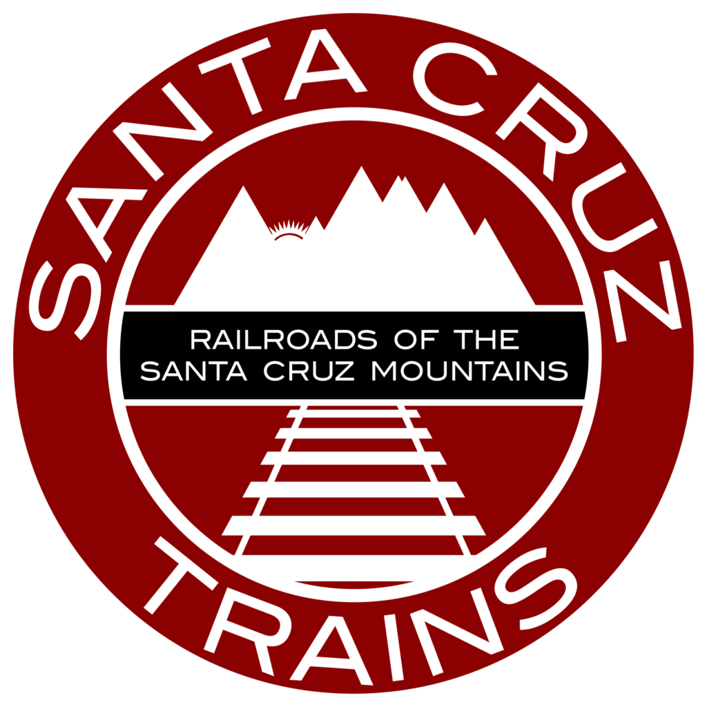
Second edition of the Santa Cruz Trains: Railroads of the Santa Cruz Mountains logo.
The revised design of the logo for Railroads of the Santa Cruz Mountains features seven mountain peaks of various heights. But now there is more to them than just that: they represent an idealized view of the Santa Cruz Mountains looking west from approximately Mountain View. From left to right, the peaks represent Frémont Peak at 3,174 ft (the last and tallest peak of the Gabilan Mountains), Mt. Madonna at 1,897 ft, Loma Prieta at 3,786 ft, the twin peaks Mt. Umunhum and Mt. Thayer at 3,486 ft and 3,479 ft respectively, Mt. Bielawski at 3,231 ft, and Table Mountain at 2,060 ft. The gaps between most of them by default represent the primary means that peoples once passed between the Santa Clara Valley and upper Pajaro Valley into Santa Cruz County. These include Chittenden Gap and Heckler Pass between Frémont Peak and Mt. Madonna, Patchen Pass between Mt. Thayer and Mt. Bielawski, and Saratoga Gap between Mt. Bielawski and Table Mountain. Meanwhile, the setting sun of the Sunset Route shining through Chittenden Pass represents the extension of the transcontinental Southern Pacific Railroad reaching into Santa Cruz County. The crimson red background matches that of some of the earliest Southern Pacific and South Pacific Coast corporate badges. It is also my favorite color.

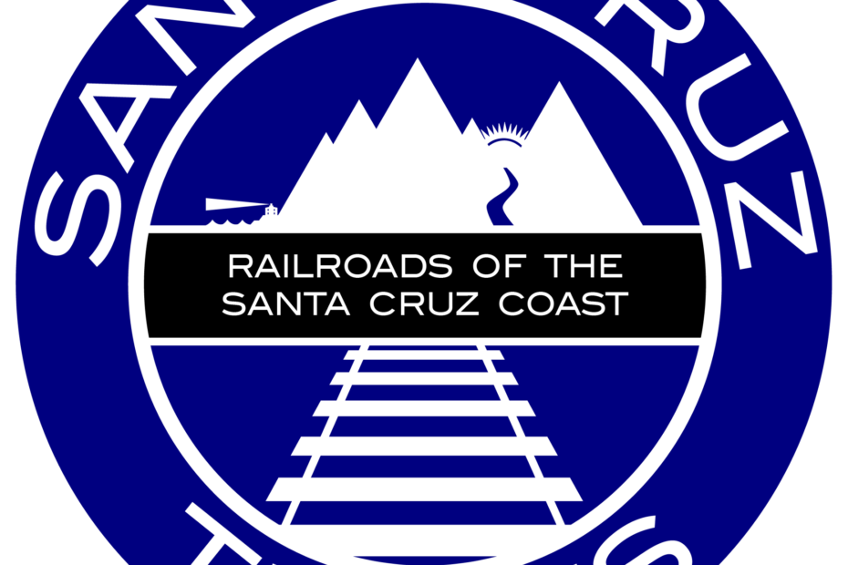
New logo for Santa Cruz Trains: Railroads of the Santa Cruz Coast.
The revised design of the first book’s logo heavily influenced the creation of the logo for Santa Cruz Trains: Railroads of the Santa Cruz Coast. The original mountain range is reversed and now shows from right-to-left Frémont Peak, Mt. Madonna, and Loma Prieta. The shining sun no longer depicts a sunset, but rather a sunrise representing the promised increase of wealth from the East that the railroad brought through Chittenden Gap to Santa Cruz County. Also shown on this side of the mountains is the Pajaro River flowing through the pass, an acknowledgement of the important role the river played in the lives of those living in South County. On the left quarter of the logo, four of the mountains from the first logo have been replaced with only two because the earlier peaks are barely visible from the Monterey Bay and others have greater importance to local history. The two new peaks represent Ben Lomond at 2,625 ft and Ocean View Summit (Big Basin) at 1,690 ft. At the far left, the waves of the Pacific Ocean lap at a low coastal terrace, atop which sits the original Santa Cruz lighthouse shining its beacon across the sea. Both these new peaks and the nautical scene represent North County and the important role the ocean, terraces, and hillsides played in the various industries there. The color of the badge reflects later Southern Pacific Railroad badges and the importance of the ocean to both Santa Cruz County history and to the theme of this book.
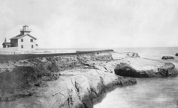
The original lighthouse on Lighthouse Point.
Neither of these logos are 100% finalized, so if there are any suggestions or critiques, please feel free to express them politely here or via email to author@santacruztrains.com.